XL824
Shown are Home and Scheduling Screens for the XL824 thermostat
HOME SCREEN
All of the elements shown were delivered by us - the interaction was partly based on VOC data we had from the XL950 design
SCHEDULER
Scheduling should be a straight-forward process, however, there were a great many IP disputes going on around smart thermostats in the category at the time. We were challenged to create an intuitive process for creating and adjusting scheduling while avoiding contested elements.
ILLUSTRATOR ASSETS
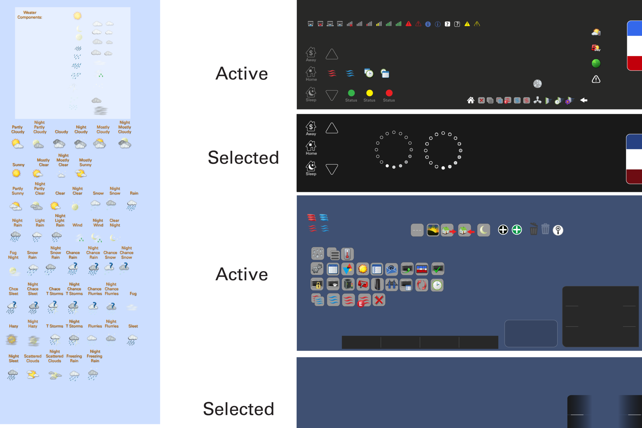
We created all of the Assets for this thermostat, which included re-creating all of the weather icons which work with standard weather input variables. We also created the animated sequences on the device, such as the waving symbol, the fan on, and the processing indicator.
BRAINSTORMING WIRE-FRAMING
Our designers utilized Azure to communicate the wireframes with the India and Colorado teams. In the lower left corner you can see a working XL950 for reference and a mockup we made for the XL850 using an Android tablet
HOME SCREEN DOCK OUT
In development, there was a push to add a great many features on the home screen. In order to keep the interface clean a slide out dock was created, which temporarily covers the weather and humidity information to adjust set points and schedules.
CREATING THEMES
The XL950 had the ability to change color schemes 'thrown in' - the team at Trane were surprised at how many customers changed the theme, and how often. We were going to create an infinite pallet, but how the colors interact with all the other graphic elements had to be balanced and controlled.
FINIAL PRODUCT
Seen here is the final product. The Colorado and India team implemented the design rules we created exactly, and also used them to create new pages for the technician set-up mode (which has it's own color scheme).


